top of page
seraataylor@gmail.com
𓍙 Remote
Baltimore, M.D. -
Washington D.C.
Case Study
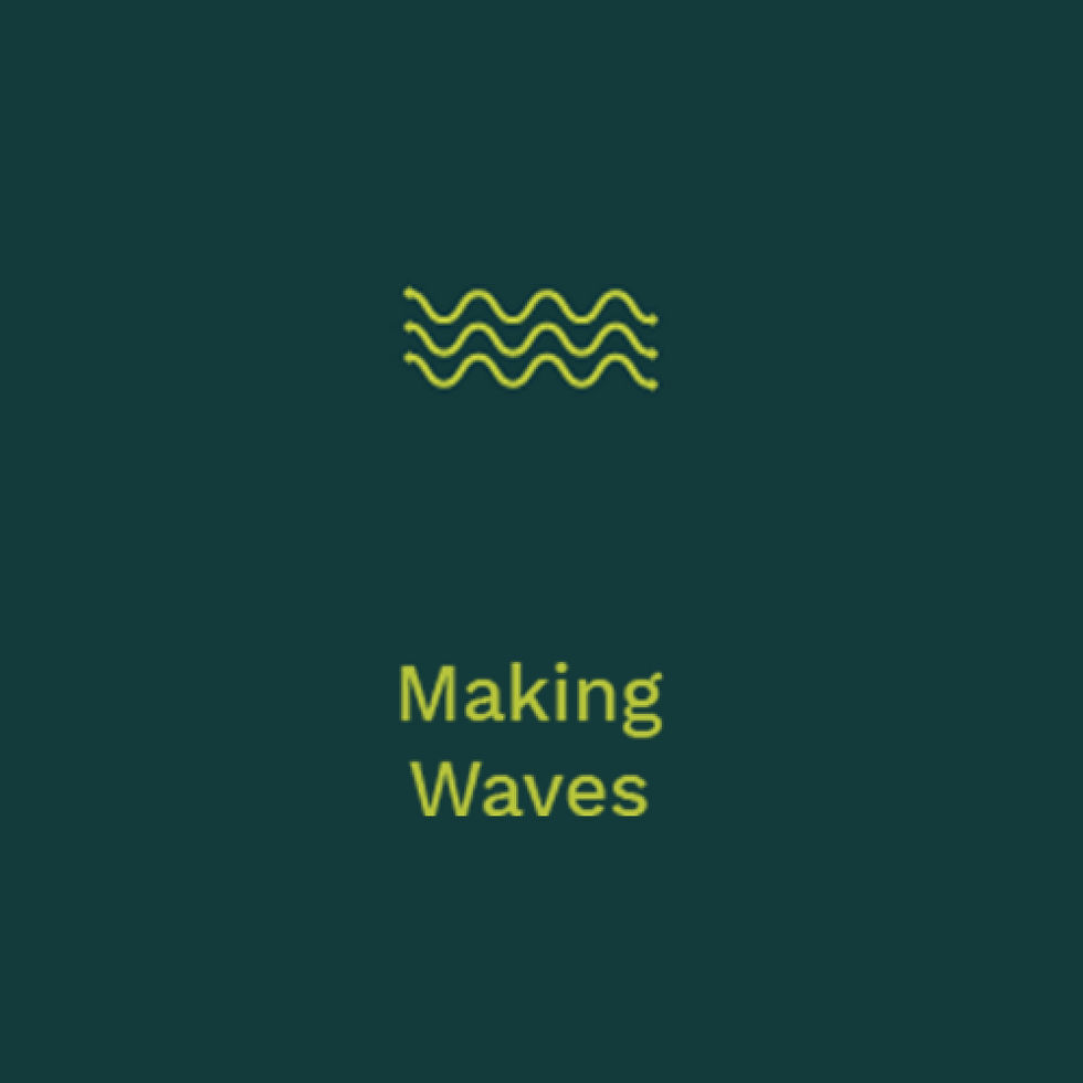
A rebrand drawing from natural textures and forms, evolving into visual cues.

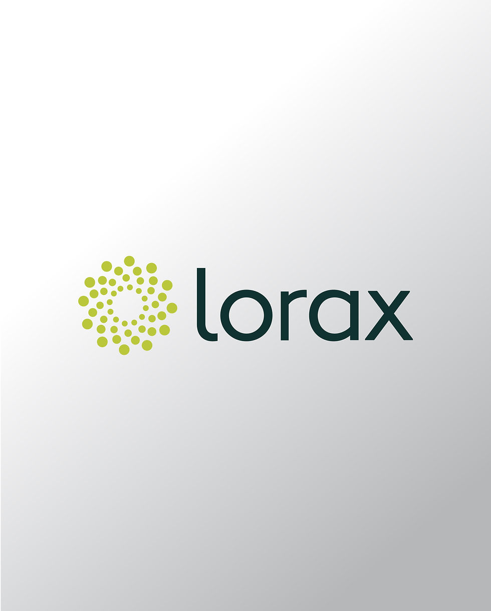
Client
Lorax Partnerships
Agency
Ashton Design -
Baltimore, M.D.
Deliverables
Logo Development
Print Communication
Digital Communication
Lorax is a sustainability-focused consultancy supporting real estate professionals in responsible development. The identity draws from natural textures and forms, translating them into a set of evolving icons and visual cues. Grounded in their mission and approach, the system feels organic, adaptable, and forward-moving.


bottom of page